
4. Chapter 1: Looking at Data – Distributions#
Before examining the distributions of our dataset (usually our sample dataset), we first need to understand what we can do with the dataset. The initial step involves calculating some values or creating graphs to describe our data. We use statistical tools and ideas help us examine data to describe their main features. This examination is called exploratory data analysis. In some textbooks, this is referred to as descriptive statistics. However, statistics goes far beyond simply describing data-this is a statistics class, not a drawing class!
Beyond description, we can use the data to make generalizations about the population, study the causal effects of variables of interest, and make predictions about future data points. These activities fall under inferential statistics, which we will spend more time on throughout the course.
For this course, our primary focus will be learning statistical procedures to make generalizations about the population from the sample. However, in this chapter, we will focus on describing our datasets using calculated values (statistics) and visual representations (graphs). Hence the title: Looking at Data-Distributions.[1]
Before we dive into the types of graphs, let’s first look at the types of data we can obtain from a particular variable. Broadly, data can be categorized into two main types: quantitative and categorical.
Categorical variables take categories as values, as the name suggests. Each category is called a level:
If the levels do not have a natural order, the variable is a nominal categorical variable (e.g., fruit categories like “Apple” or “Orange”).
If the levels have a natural order, the variable is an ordinal categorical variable (e.g., academic letter grades like “A,” “B,” “C”).
Quantitative variables take numbers as values. The magnitude and differences between numbers have quantitative meanings:
If the values can be any number within an interval on the real line (continuous values), it is a continuous quantitative variable (e.g., income measured in dollars).
If the values have jumps (discrete values), it is a discrete quantitative variable (e.g., the number of cars per household).
A dataset typically contains information on a number of cases. Cases are the objects or subjects in a study. For each case, we have measurements for different types of variables, such as height, gender, and age. Additionally, there is often a label, which is a special variable used to identify cases in the dataset (e.g., a VIN number to identify a specific car).
4.1. Displaying Distributions with Graphs#
Two frequently used graphs to describe categorical variables are bar graphs and pie charts.
A bar graph shows the count for each level of the categorical variable.
A pie chart shows the proportion of each level relative to the total.
Both are easy to understand, and you can refer to Wikipedia or your textbook for examples. For a visual representation, you can explore this website.
Now let’s turn our focus to graphs for quantitative variables: stemplots and histograms.
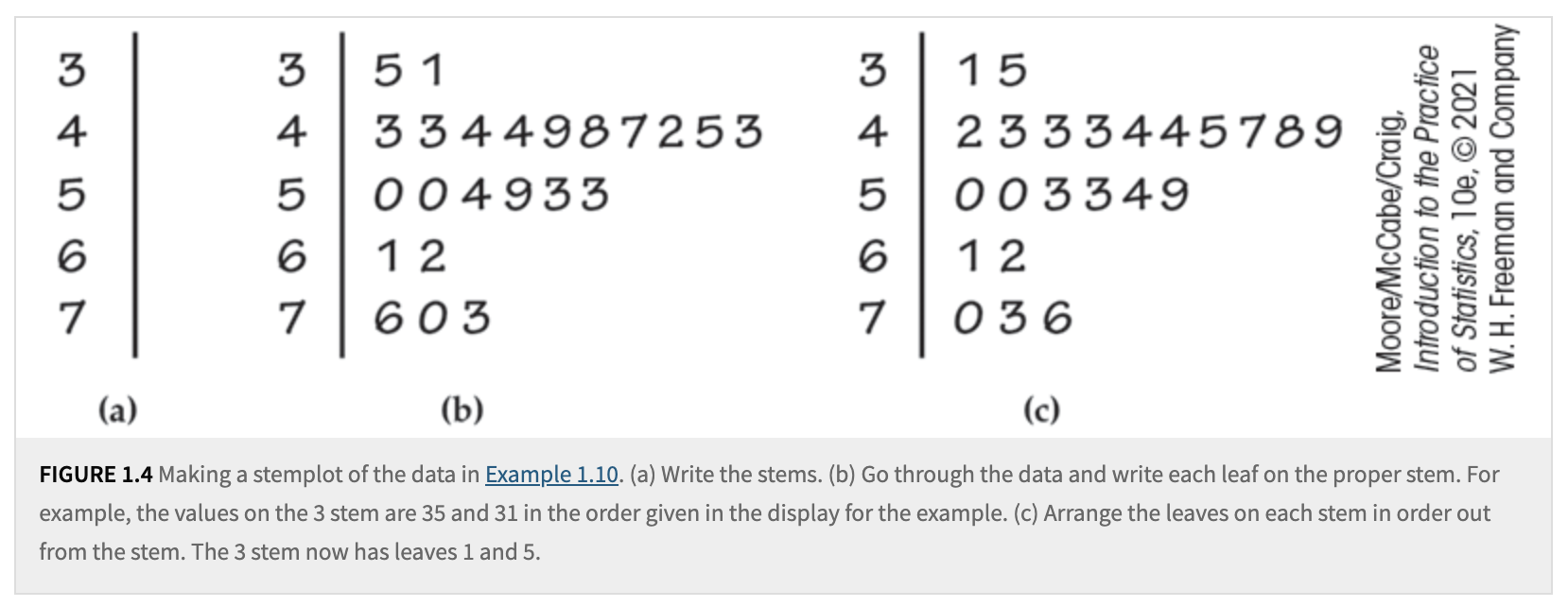
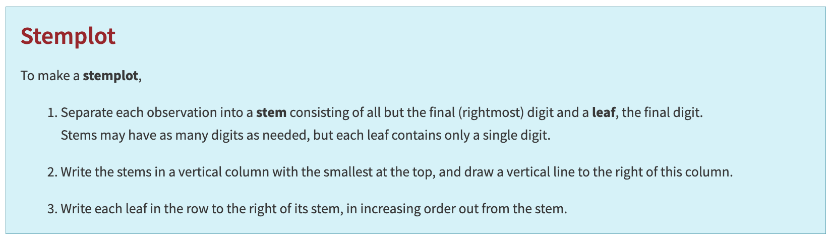
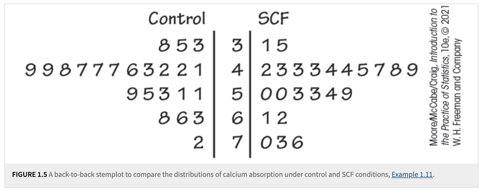
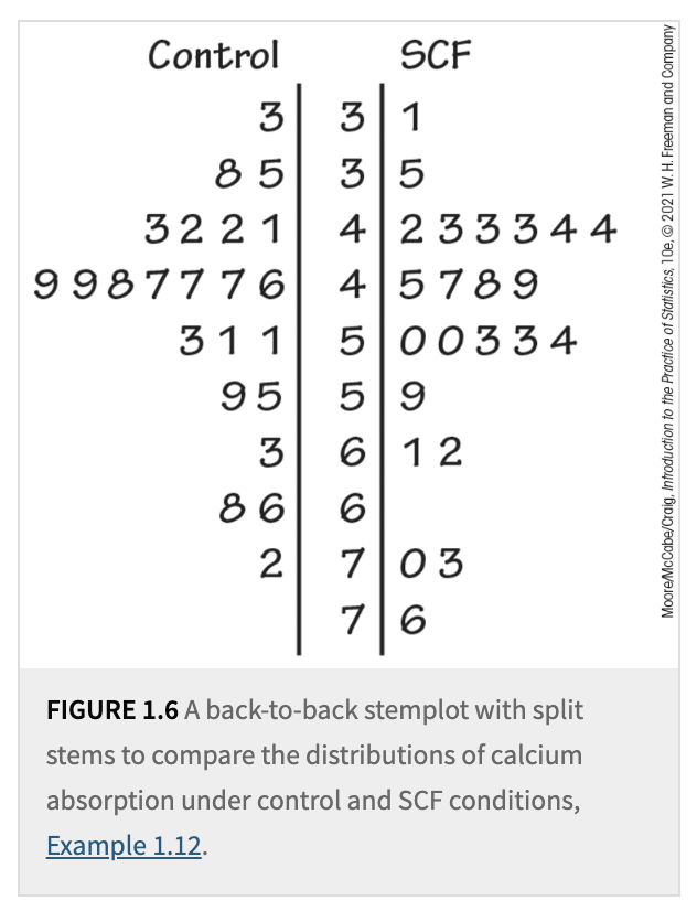
A stemplot provides a quick visual representation of the shape of a distribution while also including the actual numerical values. Stemplots work best when the number of observations is small, and all values are greater than zero.
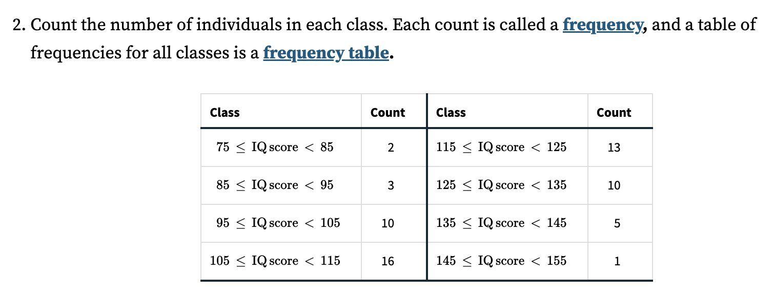
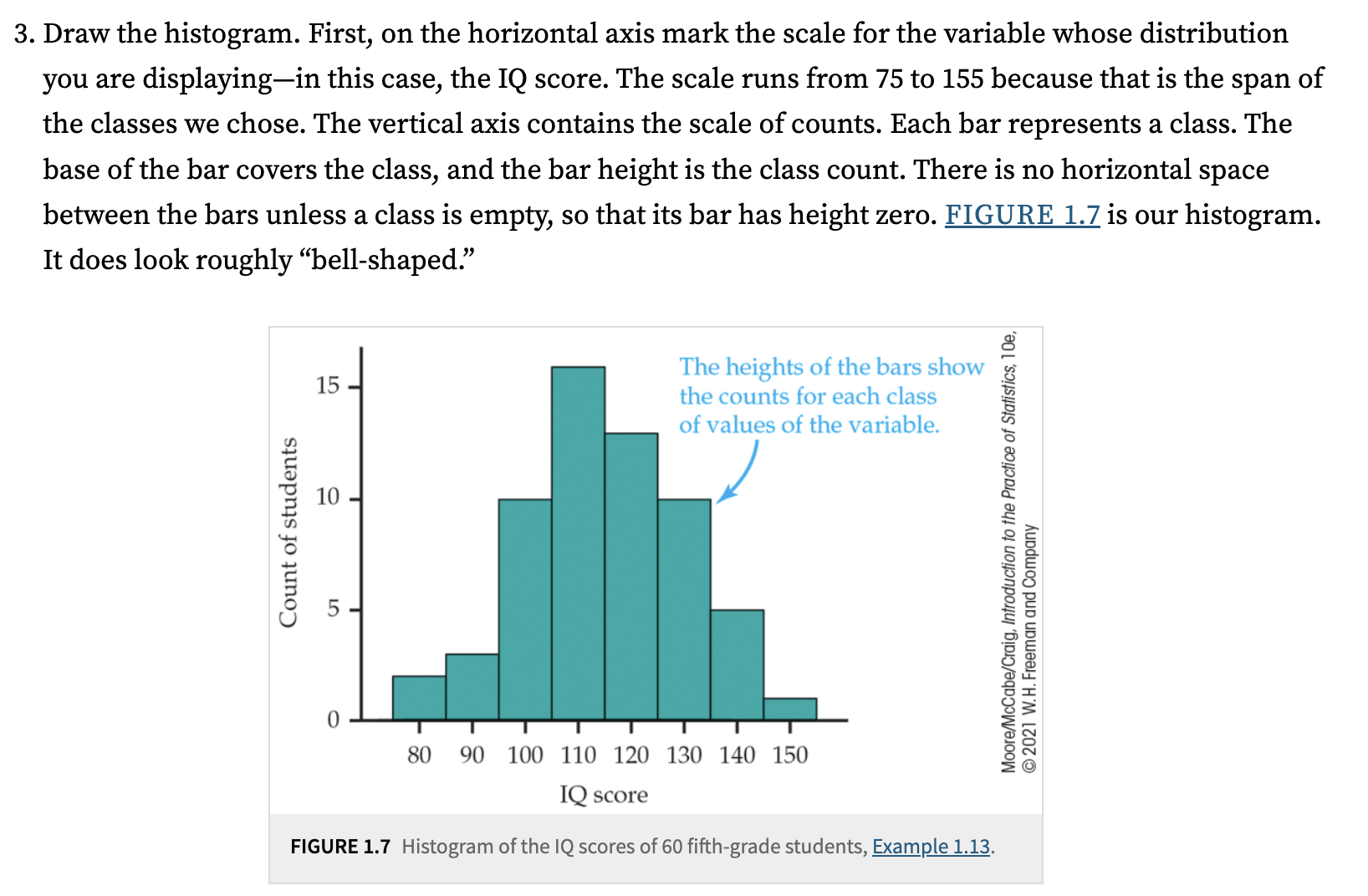
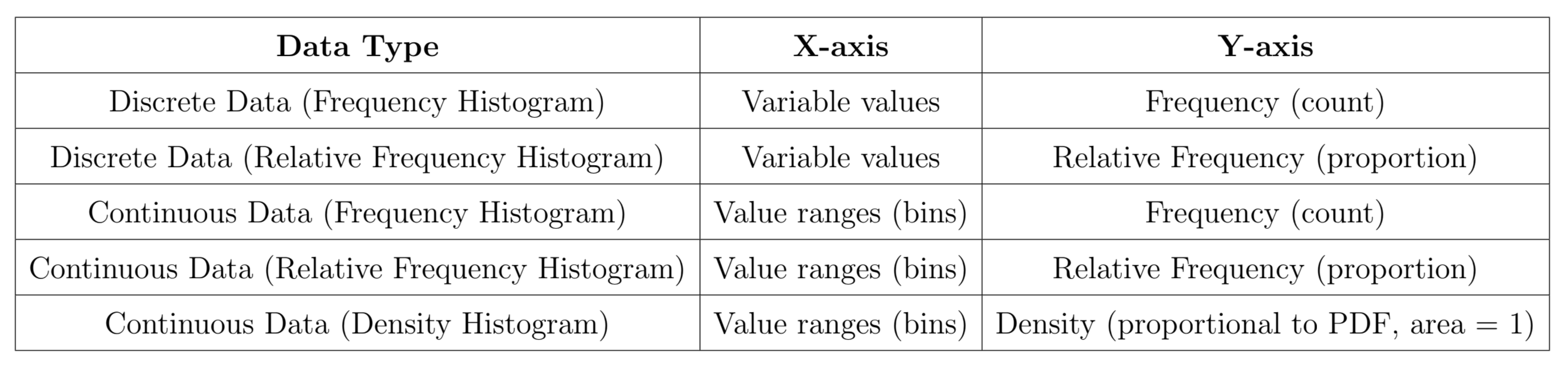
For a large number of observations, a histogram is often a better choice. A histogram divides the range of values of a variable into classes or bins and displays the count or percentage of observations that fall into each class. You can choose a convenient number of classes based on your data and the level of detail you wish to represent.
Histograms and bar charts may look similar at first glance, but there are key differences:
The horizontal axis of a bar chart does not require a measurement scale; it simply identifies categories, which is why there are blank spaces between the bars.
In contrast, a histogram has no spaces between bars, as it represents data over a continuous interval, covering the entire range.
Another observation is the use of a density curve or a density histogram based on relative frequency. The rationale behind using a smoothed curve is that it can often be parameterized by simple mathematical functions, making it easier to model the distribution mathematically.
The purpose of these graphs is to help us better understand our datasets. After graphing, we can examine the overall pattern and identify striking deviations from that pattern in the graphs or distributions. We describe the overall pattern of a distribution using its shape, center, and spread.
An important kind of deviation is an outlier-an individual value that falls outside the overall pattern and warrants further investigation to uncover its cause. Later, we will learn how to summarize these characteristics with numerical measures to describe the pattern more precisely.
For describing the shape of a distribution, we have the following:
Tails of the distribution: Extreme values are in the tails. High values are in the upper/right tail, and low values are in the lower/left tail.
Modes:
A distribution with one major peak is called unimodal.
A distribution with two major peaks is called bimodal.
A distribution with three major peaks is called trimodal.
Symmetry and Skewness:
A distribution is symmetric if the patterns of smaller and larger values around the midpoint are mirror images.
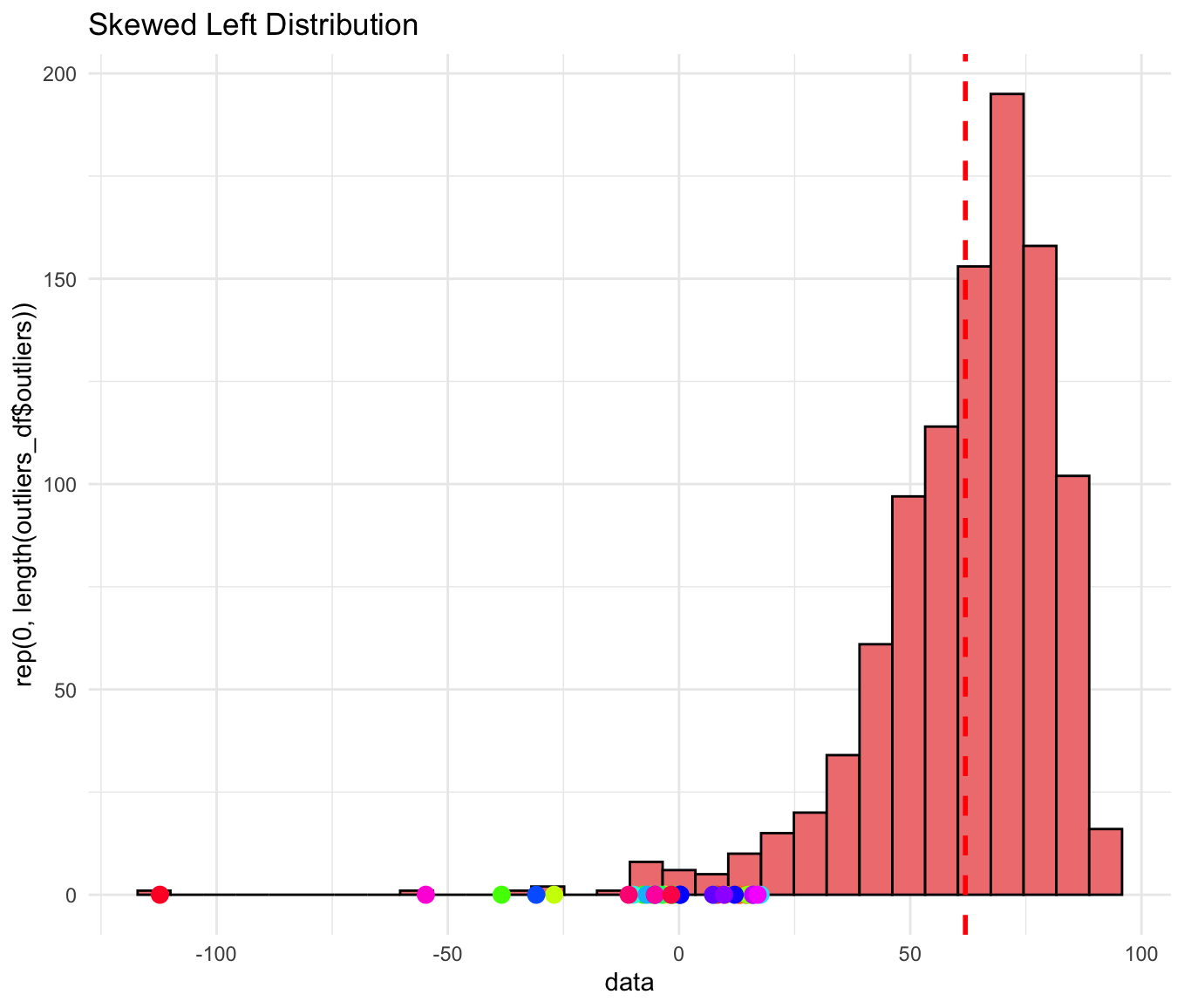
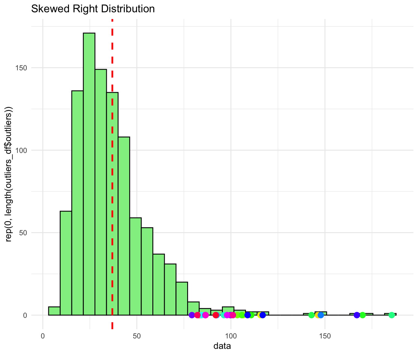
A distribution is skewed if it is not symmetric:
Skewed to the right: The right tail (larger values) is longer than the left tail.
Skewed to the left: The left tail (smaller values) is longer than the right tail.
Of course, there are many other types of graphs we can create to visualize datasets. For example, a time plot displays each observation against the time at which it was measured, making it easier to observe trends or patterns over time. As the number of data points increases, the utility of such graphs becomes even more apparent for understanding temporal relationships.
4.2. Describing Distributions with Numbers#
When you have a quantitative variable-like the heights of Purdue students-you want to summarize its distribution. A distribution can be described by its shape, its center, and its spread. This section focuses on the numerical ways to measure center and spread, and how to handle outliers.
The Mean \(\bar{x}\)
Definition: The mean (arithmetic average) is found by summing all the values and then dividing by the number of observations. Mathematically,
\[\bar{x} = \frac{x_1 + x_2 + \dots + x_n}{n}\]Illustration (Purdue Students’ Heights): Suppose we sample 5 Purdue students with heights 66, 70, 71, 72, and 75 inches. The mean would be \(\bar{x} = (66 + 70 + 71 + 72 + 75)/5 = 70.8\) inches.
Key Points:
The mean is the “balance point” of the distribution.
Not a resistant (or robust) measure: a very tall or very short outlier in the data can pull the mean up or down.
The Median \(M\)
Definition: The median is the midpoint of the distribution when the data are ordered from smallest to largest.
If \(n\) (the number of data points) is odd, the median is the single middle value.
If \(n\) is even, the median is the average of the two middle values.
Illustration (Purdue Students’ Heights): From the same sample [66, 70, 71, 72, 75], the ordered data are 66, 70, 71, 72, 75. Since \(n=5\) is odd, the median is the 3rd value -> 71 inches.
Key Points:
The median is more resistant to outliers because it depends on the order of the data rather than the actual numeric magnitude of extreme observations.
Comparing Mean and Median
If the distribution is symmetric (like a “bell” shape for heights), the mean and median tend to be close.
If the distribution is skewed (long tail on one side), the mean is pulled toward the tail more than the median.
A single measure of center (mean or median) doesn’t capture how spread out the data are. We also need measures of variability.
Quartiles and the Interquartile Range (IQR)
Quartiles:
First Quartile \(Q_1\): The median of the lower half of the data (25th percentile).
Third Quartile \(Q_3\): The median of the upper half of the data (75th percentile).
IQR = \(Q_3 - Q_1\)
Definition: The IQR measures the range of the middle 50% of the data.
Resistant measure of spread because quartiles (like the median) are not heavily influenced by extreme values.
Illustration (Purdue Students’ Heights): If we have these 8 sorted heights in inches: 60, 62, 66, 70, 71, 72, 75, 77,
The median \(M\) is between the 4th and 5th values \(\rightarrow \frac{70 + 71}{2} = 70.5\).
\(Q_1\) is the median of the lower half \([60, 62, 66, 70]\) -> between 62 and 66 -> 64.
\(Q_3\) is the median of the upper half \([71, 72, 75, 77]\) -> between 72 and 75 -> 73.5.
IQR = \(Q_3 - Q_1 = 73.5 - 64 = 9.5\).
The Five-Number Summary
Definition: A quick numerical snapshot of a distribution made up of:
\[\text{Minimum}, \quad Q_1, \quad M, \quad Q_3, \quad \text{Maximum}\]
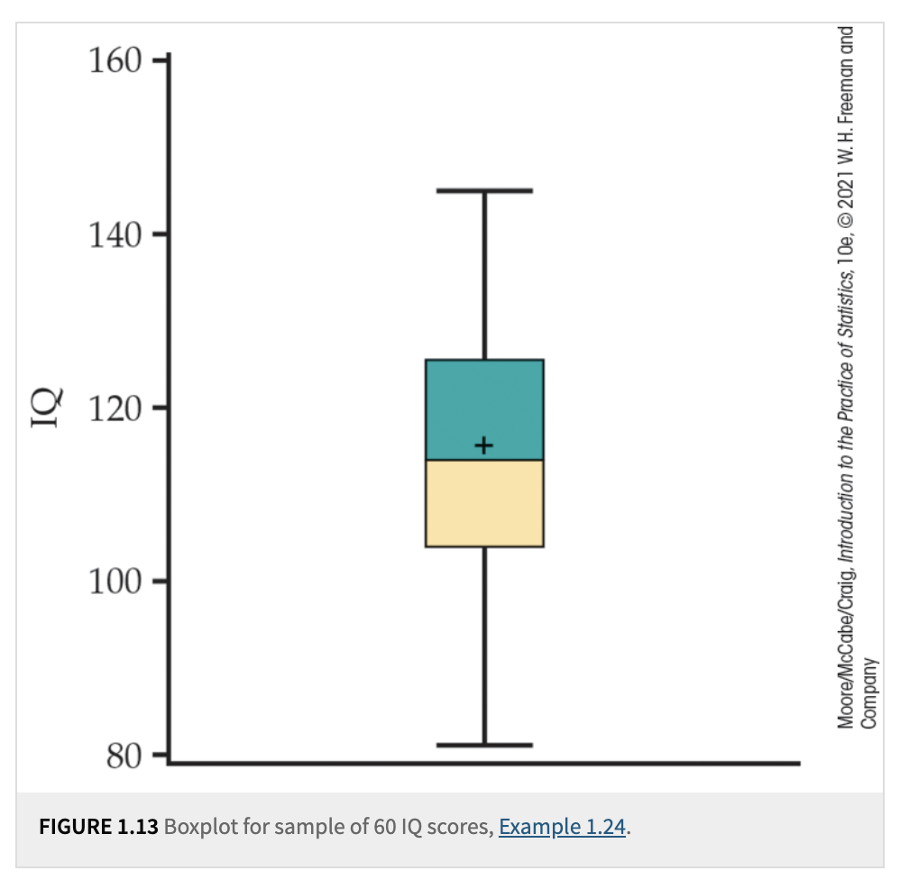
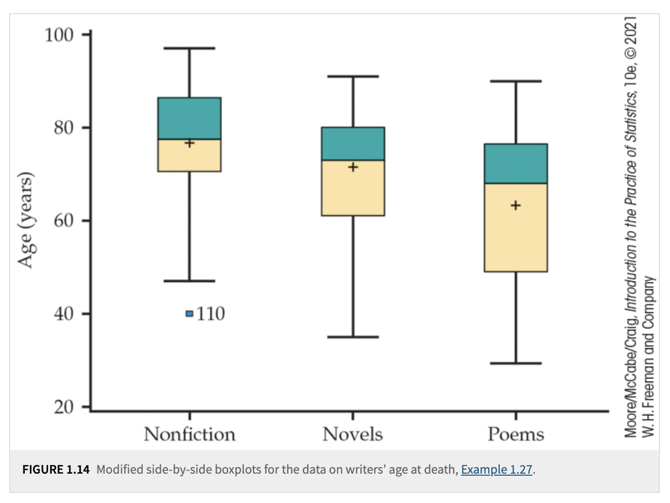
Boxplots
Definition: A boxplot (sometimes called a “box-and-whisker plot”) graphically shows the five-number summary.
The “box” covers \(Q_1\) to \(Q_3\).
A line inside the box marks the median \(M\). The mean can be represented using either a cross or an asterisk.
“Whiskers” extend out to the minimum and maximum (or to the most extreme points that aren’t flagged as outliers in a modified boxplot).
Use: Quickly visualize center, spread (the length of the box), and potential outliers.
Outliers and the 1.5 \(\times\) IQR Rule
Definition: A value is called a suspected outlier if it falls more than 1.5 \(\times\) IQR above \(Q_3\) or below \(Q_1\).
Lower Bound = \(Q_1 - 1.5 \times \mathrm{IQR}\).
Upper Bound = \(Q_3 + 1.5 \times \mathrm{IQR}\).
Illustration: If \(Q_1=64\), \(Q_3=73.5\), and \(\mathrm{IQR}=9.5\),
\(1.5 \times \mathrm{IQR} = 1.5 \times 9.5 = 14.25\).
Lower Bound: \(64 - 14.25 = 49.75\).
Upper Bound: \(73.5 + 14.25 = 87.75\).
Any height below 49.75 or above 87.75 would be a flagged outlier.
In general, we can calculate the \(P\)th percentile by following these steps:
Find the Position: Use the following formula to determine the position in the sorted dataset:
\[\text{Position} = \frac{P}{100} \times (n + 1)\]where:
\(P\) is the desired percentile (for example, \(25\)th percentile for \(Q_1\), \(50\)th percentile for the median).
\(n\) is the number of data points in the dataset.
Whole Number Position:
If the position is a whole number, use the corresponding data point at that position directly.
Fractional Position:
If the position is a fraction (that is, not a whole number), find the two adjacent data points in the sorted dataset.
Use the values at these adjacent positions and take their average to calculate the percentile[2].
Example:
To find the median (50th percentile) in a dataset with \((n = 8)\) data points, use the formula:
Since \(4.5\) is a fraction, find the 4th and 5th data points in the sorted dataset and take their average. For this textbook, the median is calculated as:
This method can be applied to any percentile by changing the value of \(P\). For example, to find the 25th percentile, use \((P = 25)\).
While the five-number summary is quite resistant to outliers, many statistical methods rely on the mean and standard deviation.
Variance \(s^2\)
Definition: The average of the squared deviations from the mean:
\[s^2 = \frac{1}{n-1}\sum_{i=1}^{n}(x_i - \bar{x})^2\]Intuition: Each data point’s “deviation” from \(\bar{x}\) is squared and then averaged (using \(n-1\) in the denominator for degrees of freedom).
Standard Deviation \(s\)
Definition: The square root of the variance:
\[s = \sqrt{s^2}\]Interpretation: Measures how far (on average) data points lie from their mean. A large \(s\) indicates the data are more spread out.
Key Points:
\(s\) is always \(\ge 0\); \(s=0\) only if all data points are identical.
\(s\) is not resistant to outliers, because outliers can dramatically increase the average squared deviation.
\(s\) is most informative when the distribution is reasonably symmetric and has no extreme outliers.
Resistant vs. Non-Resistant Measures
Resistant (Robust) measures: The median, quartiles, IQR. They are not strongly affected by a few extreme values.
Non-Resistant measures: The mean and standard deviation can shift substantially if there are outliers or skewness.
Example: If 3 or 4 extremely tall Purdue basketball players (say 7-footers) happen to be in your sample, the mean (and standard deviation) of heights will jump notably. The median or IQR might change only a little.
Choosing a Summary: Five-Number Summary vs. \(\bar{x}\) and \(s\)
Five-Number Summary (Min, \(Q_1\), Median, \(Q_3\), Max) is best when:
The distribution is skewed or has strong outliers.
You want a quick, robust snapshot of center and spread.
Mean and Standard Deviation (\(\bar{x}\), \(s\)) are best when:
The distribution is fairly symmetric with no major outliers.
You plan to use statistical methods that assume normality or revolve around the mean.
Reminder: Always plot your data (histogram, stemplot, or boxplot) to see shape, outliers, or clusters. A single numeric summary never tells the full story (e.g., multiple modes or gaps).
Sometimes, we change the units of our measurements. For example, if your heights are measured in inches and you convert them to centimeters using the formula, \(\text{cm} = 2.54 \times \text{inches}\), the new mean in centimeters becomes \(2.54 \times \bar{x}\). This kind of conversion is known as a linear transformation, represented by \(x_{\text{new}} = a + b \times x\), which shifts the data by (a) and/or scales it by (b). Specifically:
Adding \(a\) to each observation shifts measures of center (mean, median) by \(a\) but does not affect measures of spread (IQR, \(s\)).
Multiplying \(b\) scales both the measures of center and the measures of spread by \(b\).
4.3. Density Curves and Normal Distributions#
For histograms, the y-axis typically shows frequency or relative frequency. If we divide the relative frequency by the corresponding bin or class width, we obtain densities. Connecting these densities with a smooth line or curve creates what is called a density curve.
The main reason for dividing by bin width is to ensure the total area under the density curve is 1, allowing it to represent the probability distribution function of our random variable. A smooth curve is often easier to parameterize with just a few parameters compared to an irregular shape.
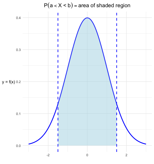
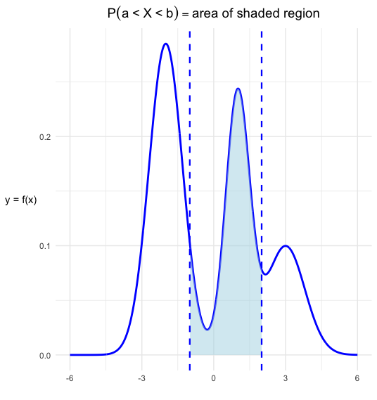
This density curve describes the overall pattern of a distribution, where the area under the curve and above any range of values equals the proportion of all observations in that range. Consequently, the probability that our random variable falls within a particular range corresponds to this area or proportion.
Mentally, you can consider the density curve to be the theoretical distribution of the random variable, whereas the histogram is the empirical distribution derived from sample data. As we gather more and more data, our histogram will more closely approximate the density curve.
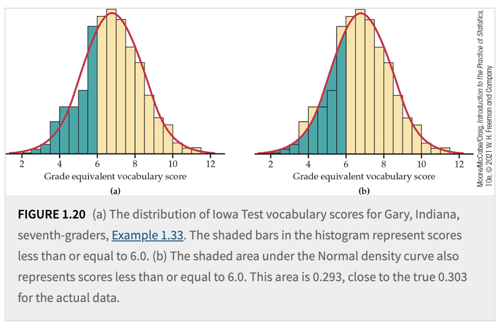
Fig. 4.1 Histogram and Density Curve#
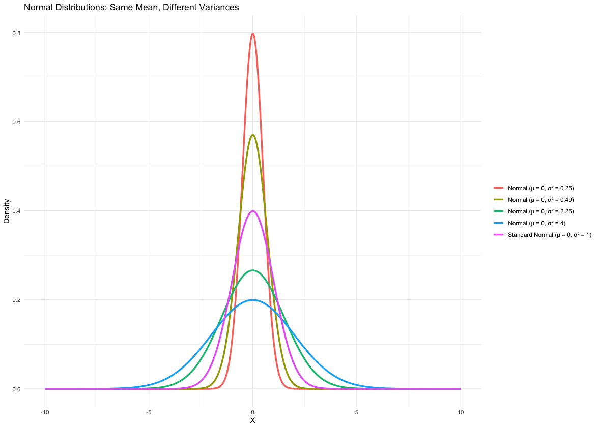
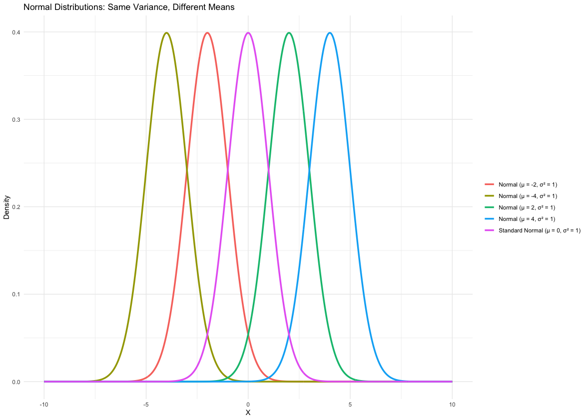
One famous type of density curve is the normal density curve. It is used in many real-world applications (such as modeling heights or the birthweights of babies). Normal distributions are described by bell-shaped, symmetric, unimodal density curves. This density curve function only has two parameters: the mean \(\mu\) and the standard deviation \(\sigma\). Depending on their values, the shape of the distribution may vary, but it still retains the aforementioned bell-shaped and symmetric features.
Here are five properties of normal densities:
Symmetry: The normal distribution is symmetric around its mean (\(\mu\)). The left half of the curve is a mirror image of the right half.
Mean, Median, and Mode are Equal: In a normal distribution, the mean, median, and mode are identical and located at the same point (\(\mu\)).
Bell-Shaped Curve: The graph of the normal distribution is a smooth, bell-shaped curve. Most data points are concentrated around the mean, with frequencies decreasing as you move away from the center.
Defined by Two Parameters: The normal distribution is completely determined by:
Mean (\(\mu\)): Determines the center of the distribution.
Variance (\(\sigma^2\)): Controls the spread of the distribution.
Asymptotic Behavior: The tails of the normal distribution extend infinitely in both directions but never touch the horizontal axis (asymptotic to the \(x\)-axis).
We start with the simplest normal distribution, the standard normal distribution, because any normal distribution can be obtained from it by shifting and scaling.
A standard normal distribution has a mean of 0 and a variance of 1. We denote a standard normal random variable by \(Z \sim \mathcal{N}(0, 1)\).
The PDF (probability density function) of the standard normal distribution is:
Let \(Z \sim \mathcal{N}(0,1)\) be a standard normal random variable. Then
is said to have a Normal distribution with mean \(\mu\) and variance \(\sigma^2\). We denote this by \(X \sim \mathcal{N}(\mu, \sigma^2)\). To transform \(X \sim \mathcal{N}(\mu, \sigma^2)\) to a standard normal distribution, we use:
The PDF of \(X\) can be expressed as:
Remember, densities are quite useful because they tell us the probability of statements like \(\mathbb{P}(X < x)\) or \(\mathbb{P}(\text{Height} < 70).\) If our variable of interest is a standard Normal variable (i.e., a variable with a standard Normal density), then probabilities such as \(\mathbb{P}(Z < z) \text{or} \mathbb{P}(Z < 1)\) can be found directly using a z-table.
Theoretically, we could create a similar table for each Normal distribution to tell us these probabilities, but that’s not practical. Instead, we keep a single z-table for the standard Normal distribution. If our variable of interest is Normal (but not standard Normal), we can still find probabilities by standardizing:
So, if \(X \sim N(\mu, \sigma),\) then \(Z \sim N(0, 1),\) and we can use the z-table for calculations and finding the probabilities.
Since we have this relationship, the only thing left is to become familiar with the areas under the standard Normal density and how to use the z-table.
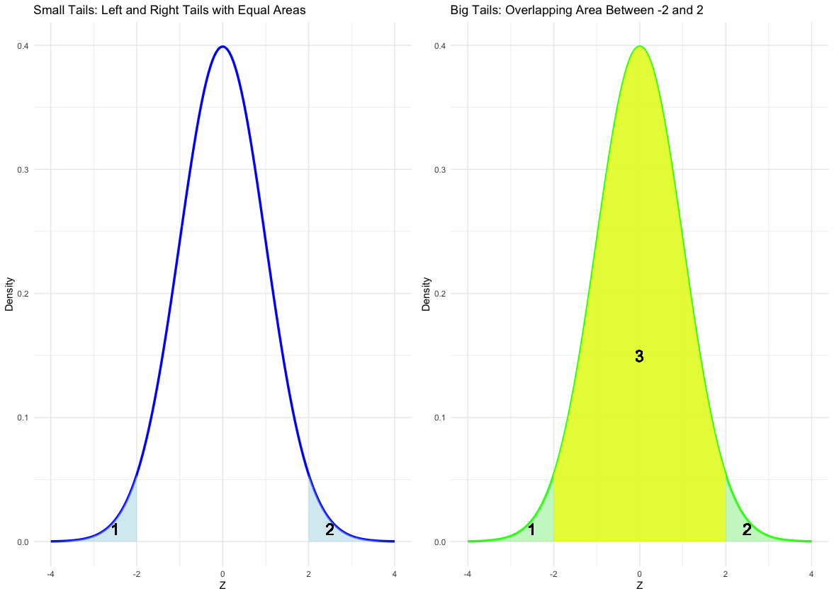
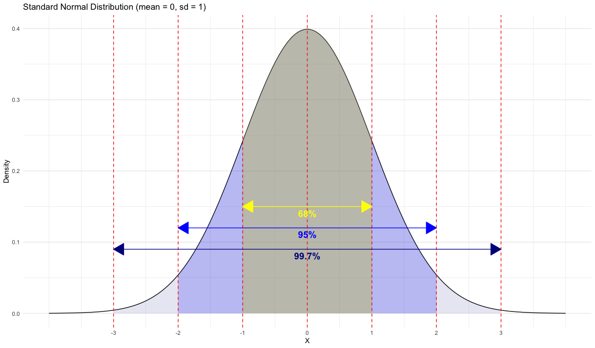
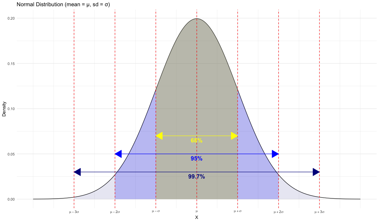
For any Normal density, there is the 68–95–99.5 empirical rule that we can use for quick approximations.
Definition 4.1 (The 68-95-99.7 Rule)
In the Normal distribution with mean \(\mu\) and standard deviation \(\sigma\):
Approximately \(68\%\) of the observations fall within \(\sigma\) of the mean \(\mu\).
Approximately \(95\%\) of the observations fall within \(2\sigma\) of the mean \(\mu\).
Approximately \(99.7\%\) of the observations fall within \(3\sigma\) of the mean \(\mu\).
Now, you should be able to use a z-table to handle several types of probability statements, such as:
Given \(X \sim \mathcal{N}(4, 1.5)\):
\(P(X < 3)\)
\(P(X > 4.5)\)
\(P\bigl(3 < X < 4.56\bigr)\)
and so on.
Backwards Normal Problems (Inverse Normal Calculations): finding \(x_0\) such that
\(P(X < x_0) = 0.95\)
\(P(X > x_0) = 0.9236\)
One last thing to mention is how to use Normal Quantile Plots to check Normality for your datasets. Here are the steps to construct such a plot:
Definition: A Normal quantile plot (sometimes called a normal probability plot) is a diagnostic tool. You:
Sort the data from smallest to largest. Rank the data \((i=1)\) is smallest, \((i=20)\) largest.
Assign each data value a percentile (like 5%, 10%, etc.). Assign percentiles via \(\frac{i}{n}\).
Find the corresponding z-score for each percentile (from the Standard Normal). Convert percentiles to z-scores.
Plot each data value vs. its matched z-score. Plot (z-score on x axis, data value on y axis).
Interpretation:
If the resulting plot is roughly a straight line, then the data follow a Normal pattern.
Systematic curvature in the plot indicates non-Normal data.
Outliers appear as points that deviate noticeably from the pattern.